
| 일 | 월 | 화 | 수 | 목 | 금 | 토 |
|---|---|---|---|---|---|---|
| 1 | 2 | 3 | 4 | 5 | 6 | 7 |
| 8 | 9 | 10 | 11 | 12 | 13 | 14 |
| 15 | 16 | 17 | 18 | 19 | 20 | 21 |
| 22 | 23 | 24 | 25 | 26 | 27 | 28 |
| 29 | 30 |
- 에러기록
- matplotlib
- 옵시디언
- 고체역학
- MATLAB
- IEEE
- 인공지능
- WOX
- pytorch
- Dear abby
- 논문작성
- Linear algebra
- obsidian
- 수식삽입
- ChatGPT
- Python
- Julia
- Zotero
- 논문작성법
- 우분투
- 텝스공부
- Statics
- JAX
- 수치해석
- Numerical Analysis
- 딥러닝
- teps
- LaTeX
- 생산성
- 텝스
- Today
- Total
뛰는 놈 위에 나는 공대생
[matplotlib] x,y축 format 지정하는 방법 본문
matplotlib에서 log scale그래프를 그리다가

다음과 같이 y축 숫자표기가 너무 크다는 것을 발견하고 이를 수정하기 위한 코드를 작성하였다.
여러 방법을 찾아보긴 했는데 내가 느끼기에 가장 간단하고 범용성이 높은 방법은 다음과 같다.
1. axes 인스턴스 필요
대부분의 matplotlib 그림에서 고급 기능을 쓰기 위해서는 axes 인스턴스를 필요로 한다. 이 axes는 내가 그리고자 하는 figure에 할당된 class인데 그 내부에서 구체적으로 설정하는 매서드가 담겨있어서 이것에 접근해야한다.
plt.plot(num_history, train_mse_history)
plt.ylabel('MSE')
plt.xlabel('epoch')
plt.yscale('symlog')
ax = plt.gca() # 인스턴스 받는 코드
plt.gca()는 현재 내가 그리고자 하는 plot에 대한 axes instance이다.
또는 그림을 다음과 같이 그릴 때 axes 인스턴스를 얻을 수 있다.
fig, ax = plt.subplots()
2. format 지정
matplotlib.ticker에 formatter가 여러 개 있고 이중에서 다음 ticker.StrMethodFormatter를 가지고 온다.
from matplotlib import ticker
plt.plot(num_history, train_mse_history)
plt.ylabel('MSE')
plt.xlabel('epoch')
plt.yscale('symlog')
ax = plt.gca()
ax.yaxis.set_major_formatter(ticker.StrMethodFormatter("{x:.2f}"))
plt.show()
format은 .2e 등 다양하게 지정할 수 있다. ($10\times e\pm 3$ 정도의 스케일은 지수표기법으로 하는 편이 나을 것 같다.)
3. 추가적인 format들
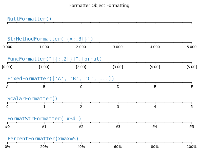
아래 그림을 보면 formatter 여러 종류를 바로 파악할 수 있다.
참고자료
https://matplotlib.org/stable/gallery/ticks/tick-formatters.html
Tick formatters — Matplotlib 3.7.1 documentation
Note Click here to download the full example code Tick formatters Tick formatters define how the numeric value associated with a tick on an axis is formatted as a string. This example illustrates the usage and effect of the most common formatters. import m
matplotlib.org
'연구 Research > 데이터과학 Data Science' 카테고리의 다른 글
| [데이터과학] scipy interpolation 종류 정리 (0) | 2023.08.25 |
|---|---|
| [Matplotlib] 3D scatter plot 그리는 코드 (0) | 2023.04.28 |
| [데이터과학] Pandas에서 dataframe 생성 및 export (0) | 2023.04.27 |
| [데이터과학] Unbalancing data 처리 (0) | 2021.05.26 |
| [데이터과학] 결측치 Missing Data 처리 (0) | 2021.05.25 |

